Standards and Mobile
By Michael Millett | Published March 8, 2013
I love the web. I spend my work day building for it, and often, once the kids are down for bed, my mind goes right back to building and lingers there even after I'm asleep. So a few years ago when someone at Discount proposed building an app for our mobile users instead of a site, I thought there might be a better way. Chipotle's app was used as an example of what our mobile app could be like, and what it could mean to our customer, and many people began to dream big about carving out some territory on every customer's mobile homescreen. But Discount Tire is not Chipotle, and we have a different relationship with our customer than they do with theirs. I felt completely sure that a strong mobile web presence would be more useful to our customer, and thus better for us, than an app would.
Doing it on the web means we only need to write it once. It means new features, improvements, and fixes can be made available to our customers immediately. Building an app would have really meant building a few apps. iOS, Android, Windows, others?. Who do we leave out? How do we balance the cost of hiring a developer with skills on a platform the company has no existing expertise in, with the cost of simply ignoring the customers on that platform. I don't mean to suggest apps are bad for retailers, just that investing in apps before representing ourselves on the mobile web would have been bad for us.
Of course we had a site that you could get to on your phone just fine at the time, but using it wasn't particularly delightful. We'd kept our trusty table-based layouts on the field for a little too long, and navigating our necessarily multi-step shopping experience was pretty much awful. Some customers dug in and did it, but not many. We weren't doing them or ourselves any favors with what we had.
I spent one weekend in march of 2010 building a working demo at home for a mobile optimized store locator, the most obvious demand a customer on the road would would make of us. (Screenshots?) I showed it to the management of my department, and they were instantly on board. We started with a store locator only, built in PHP and hosted separately from the rest of our site. We launched it quickly, it worked great, and for a time, i started down the path of writing the rest of the site from scratch on that platform. However, the IT stake holders here aren't overly fond of anything but Java, and it became clear there wouldn't be much support from anyone but ourselves for a PHP based mobile site.
That was a blessing in disguise. The resistance we encountered lead us to propose a better solution. Rewrite our site using web standards, and use different stylesheets to optimize the experience on different sized screens. We could improve the desktop experience by casting off the creaky old tables, and with the same code base, deliver an all new mobile experience.

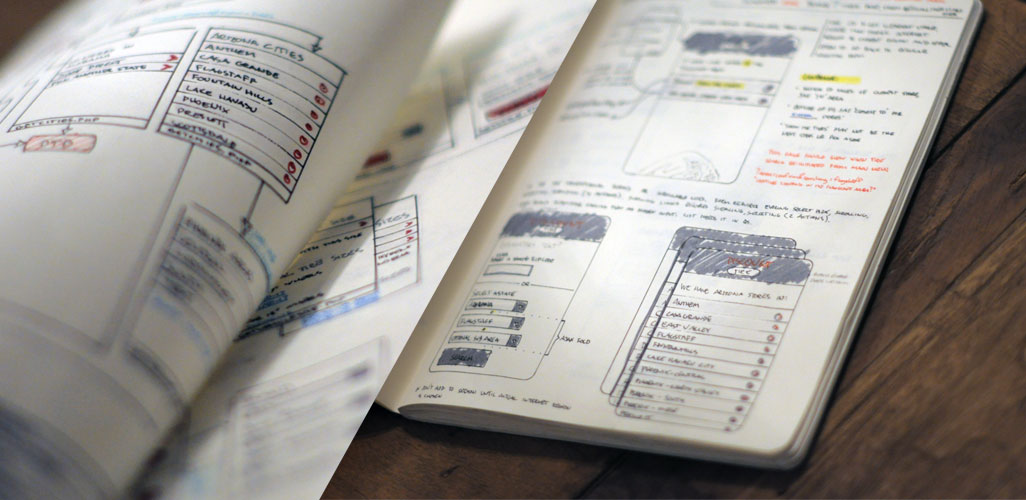
Sketches for the the mobile locator.
If we could pull off the rewrite within our small ebusiness team (responsible for design and markup, not server-side programming, and thus not part of the IT organization), we could avoid the big prioritization processes and headaches that most projects are beholden to. The challenge was that a standards based rewrite was going to be very unfamiliar territory for the rest of the design and markup team. They knew markup with tables like the back of their hands, but hadn't yet subjected themselves to the nuanced subtleties of doing layout with CSS. A significant portion of the project's timeline was going to need to be appropriated to learning.
Development began in earnest in June of 2011. I had approximated that it would take the team about 4 months. This was to be an entire overhaul of the site's markup. Every single line of every file was going to change in one way or another. Turns out that projecting timelines is, as they say in management, an opportunity for improvement for me. Anyway, it took a little longer. We launched on January 18, 2012. 95% percent of the full desktop site works on a mobile device just as well (if not better for having no marketing fluff to distract the viewer). I'm really happy about that. This isn't a watered down mobile hack, for the sake of saying we have a mobile site. It's the real deal.
We ended up saving a little more than 50% in delivered bytes by switching away from tables and we're up to 20% of our traffic coming in on mobile devices. Obviously this new site is a win for customers and for Discount Tire, but there is one aspect that I remain unsatisfied with. We didn't do this as a responsive or adaptive design. We offer a fixed width, desktop-assuming layout on the 'www' subdomain, and a percentage based mobile optimized presentation on the 'm' domain. It isn't the most elegant, efficient, or accurate approach to be sure, and UA sniffing to get mobile users who end up on the desktop site over to the mobile one kinda sucks. We're tackling the mail-order division's website this year, and I hope to go adaptive for that one. The design is already set, so making it responsive isn't a great fit, since extra design beyond what i'll do for mobile isn't really in scope. One step at a time.